Painting with Paulson
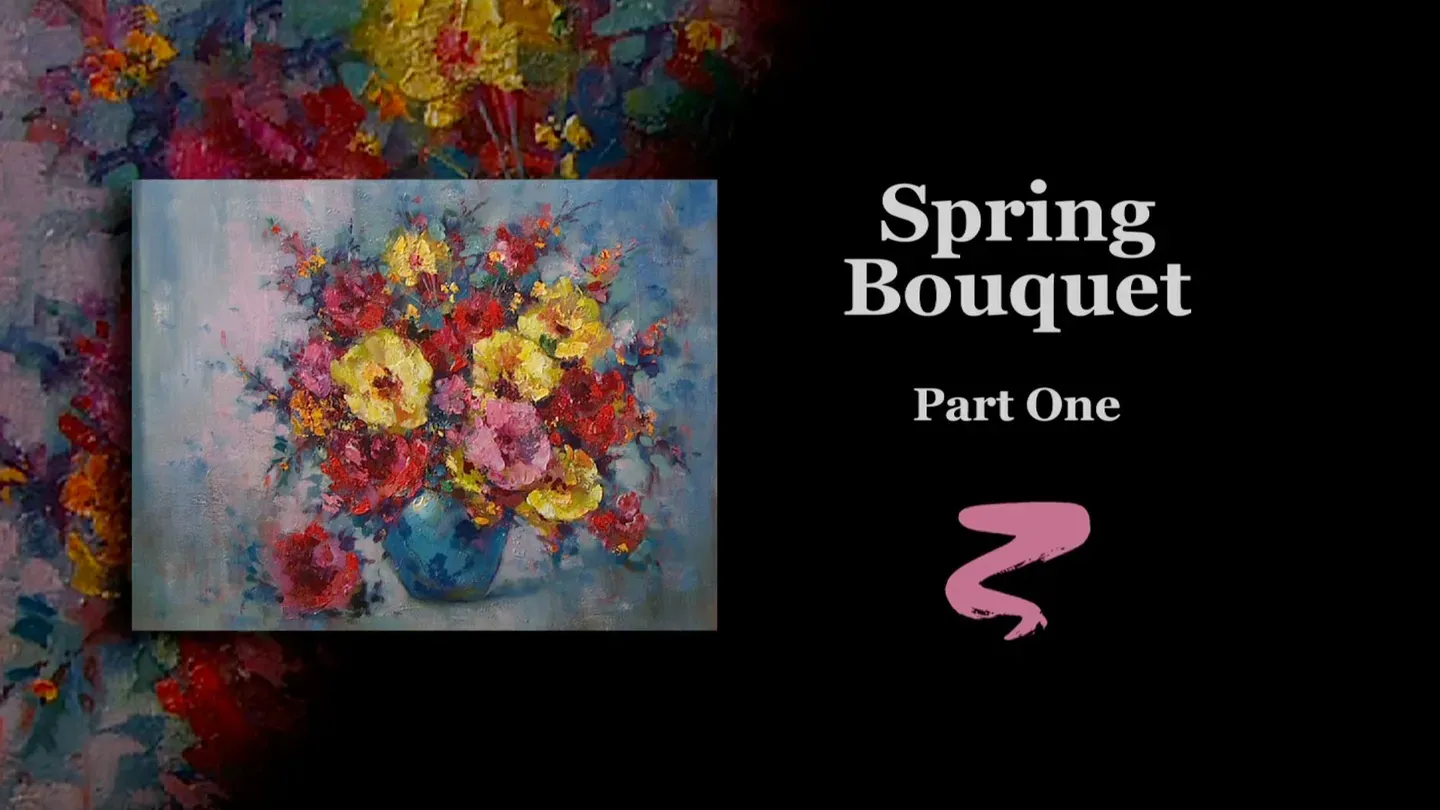
Spring Bouquet Part I
1/1/2025 | 26m 46sVideo has Closed Captions
Buck paints the first stage of Spring Bouquet.
To kick off series 10 of Painting with Paulson, Buck paints the first stage of a beautiful bouquet of flowers using only acrylic paint.
Problems with Closed Captions? Closed Captioning Feedback
Problems with Closed Captions? Closed Captioning Feedback
Painting with Paulson is a local public television program presented by Prairie Public
Painting with Paulson
Spring Bouquet Part I
1/1/2025 | 26m 46sVideo has Closed Captions
To kick off series 10 of Painting with Paulson, Buck paints the first stage of a beautiful bouquet of flowers using only acrylic paint.
Problems with Closed Captions? Closed Captioning Feedback
How to Watch Painting with Paulson
Painting with Paulson is available to stream on pbs.org and the free PBS App, available on iPhone, Apple TV, Android TV, Android smartphones, Amazon Fire TV, Amazon Fire Tablet, Roku, Samsung Smart TV, and Vizio.
Providing Support for PBS.org
Learn Moreabout PBS online sponsorshipOne of your most priceless possessions is your imagination.
Just imagine that these flowers are being painted for you!
[piano plays in bright rhythm & tone] ♪ ♪ ♪ ♪ What a great way to start a new series-- with flowers!
And doubly so when yesterday I was able to view a prize-winning flower garden.
So I pay tribute to Virginia-- you've inspired me!
Now let's go to the palette and I'll show you what we're going to mix up first.
Oh, let me change that and go to the canvas.
This is Ultramarine Blue and white, and then I've outlined it with pure Ultramarine blue.
So that's the drawing.
That will be on the bonus feature.
Anyway here is the mixture that I wanna put over the, kinda the whole background.
This is Permanent Green Light, Ultramarine blue, equal parts, and then we'll add white to that.
And then I'll decide if I need to add just a touch more blue.
Having the original right near is such a great way, because I can just hold this up and say oh, just a little more blue.
All right, there we are.
Regardless what we put on now, it'll be a kinda of play with what's on the canvas already.
Okay, I'm dipping in with a large brush into the water, this is all acrylics.
Did I say that?
This is part one.
And after I've put this on, I will take and wipe a little bit, because it's still wet enough to kind of make that combination of underneath and on top come through.
It's such a pleasure to beginning my 21st year on PBS, my 10th anniversary with Prairie Public Television!
Thank you watching, thank you for supporting PBS!
It makes it possible for these shows.
and I know how many of you learn from the shows.
I have received emails and requests for DVDs from Africa, from Sweden, and many from Canada and across the United States.
So it's so heartening for somebody to say oh we saw your painting down here in Africa.
Could we learn more about what you do.
Isn't this pretty?
It's a combination now.
You can see or you can feel a little bit of the blue coming through.
As thinly as I put that on, if it had been over white, it would have been very weak.
So it's so nice to prime a canvas.
I do it 99.99% of the time.
I love to have a prime, and it can be different ones.
Okay now while I have the large brush, I'm going to put just a little pink in the window.
So I have Quinacridone rose.
That's not really a difficult thing to spell, but it's difficult to say.
Quinacridone Rose and white.
I'll make use of this large brush.
Let me just hold this over.
The reason I'm doing this, to see do I need to put any Yellow Ochre in that and I don't think so.
If we do, we'll do it when we come with the oils.
So back to the water, and you notice after I dipped into the water, I wiped just a little bit so it's not too runny.
And notice how I'm putting this on.
Instead of just brushing, I'm pushing a little bit like this.
It goes very well, and it in addition lets that new color show through just a little bit, because you want the feeling of sunlight, sunlight coming through the windows and yet at the same time, you're showing the direction of the light coming from the left and hitting the flowers.
So there's an inner source of light.
(soft scraping) Now I'll kinda scrub around as I go further out to the sides.
When we come down to the table, it would be helpful to have a little bit-- well this, let's see.
That would be about, yeah right in the middle there would be where we have our window, so some of this light will be representing on the table.
We'll put some next to the vase.
Do you want to become a vase?
Okay like that and some over here like that.
Oh, I'd just love to push a little in there, but I won't do it.
Yeah, we did.
All right, let's put that down and now we'll come with a little bit darker blue.
I'm going back to my original pile here.
This is Ultramarine Blue, just a touch of white in that, maybe a little green with it too.
Let's take a check.
I think that-- oops.
You know, you you mislead me.
Put a little more blue.
Ah!
I love this color.
I love pure color.
Okay, this is the blue.
Yes, this is what I want, to just protect the corners a little bit.
When you say protect the corners, it means you darken them a little bit so your focus is on the inside of the canvas.
(soft scraping) It looked kind of rough, but oh, I love the energy that's there already!
All right, we have just a side of the wall showing right here.
This is pretty straight.
Where is it straight?
Right on the edge-- isn't that perfectly straight?
Yes, but it also needs to be just a little straight on the inside too.
Okay then if I just watch just a little bit, just get a little feeling, yes, that's where the window is.
All right, I'll set down this brush, I'll clean it first.
And then we'll go to a smaller brush and what I want to do is to begin to put something on the vase.
Pure Ultramarine blue... and with the light coming from the left, here's what I have to consider, is that there's shadows and there's form.
So we'll go darker here, and then the lightest light will be there.
The nice thing I have in my hand is kind of a wet paper towel so that I can just kind of-- Maybe I better get a clean wet paper towel... so I can kind of work with this just a little bit while it's wet and you can get just a little bit more of a gradation.
See isn't that a little more gradual?
Now, there's a cast shadow that comes down in here.
That's the shadow from the vase.
And let's see, what else?
Okay, let's stay with the vase, just for a minute.
And the first thing I'll put on there, let's take some of the pink, and we'll eventually go up to a white.
I like this idea and my students hear it all the time.
I say build, build to the lights.
Which means you put on a little color and you go a little lighter and a little lighter and finally a good final light-- that's building to the lights.
All right, let's take pure white and that will have been our building.
And the thing about the highlight, let me just look at you.
When you put on a highlight, what would make it round?
What would make it square?
What would make it rectangular?
The source of the light.
If it's coming through a window, it might be a rectangle.
If it's coming from a light bulb, then maybe have a little more roundness.
So you have those things in mind for when you're first putting the form on, you want it to represent the form here.
So I have kind of a roundness.
If I put my hand on it, it feels right.
But we have a light that has almost like fluorescent light that would cast that shape of light on it.
All right now I'll take and go into the inside of the arrangement with the a little of the Ultramarine Blue.
I kind of want it to be a little watery on this.
Did I tell you that Virginia, whose garden I saw, that she won an award.
The committee-- the committee was smart too.
Okay, I'm placing this in, which will represent a little bit of dark leaves in-between the flowers.
And you don't necessarily see their shapes.
You'll see their shapes more of when they come on the outside.
A little bit down in there.
Still going with the Ultramarine Blue.
Now what would help a little bit too, let's see, do we need any more Ultramarine Blue?
Some of these little leaves, I'd almost like to hold off until we come with the oil, but I do want to kind of reestablish the little twigs.
Oh, it's such a temptation to throw just a couple leaves on while you're doing it and notice when I put the leaves on, let me do another one that I'll put the little leaves on.
I just kinda touch a little bit.
There's time when I put a leaf on and I kind of just flatten out and it'd be like a nice leaf.
We'll have some of those too, but for now, I'll represent more placement of everything rather than the actual finished caricature.
More blue.
I've run a little fast, I'm just picking up Ultramarine Blue.
And come up above.
Having a little bit of the dark next to the flowers will let them stand away from the background, but notice on the background, you can see a little character almost suggest some small faint flower-- leaves rather-- and that's a nice feeling.
It gives a little more dimension to it, rather than just flat away from the wall.
Now the one thing I'm going to do with the flowers which I haven't done before, usually I come, I just fill the whole thing in quickly with kind of a solid color, I'm going to take and make the flowers just a little more pastelly so that when we come with the oils, we can glaze in a little darks and work into them, because the second part of this is all oils, and that makes it work quite well.
So let's let's go ahead just with a little bit of the flower aspect, and when I say that I have my Quinacridone Rose and in putting on the red ones-- see normally I'd have just placed that up there and say let it go, but I'm going to have it a little softer and there's one other aspect on the flowers that I want to do too.
And that is rather than just putting in the perfect roundness that you have, I'm going to go just a little variety on that.
So where's our first red one-- up here.
Okay, I'll place this on, ooh, I think I'll get just a little more red.
That's better.
Now, instead of just filling in which you'd say okay that's the flower, the circle-- kind of like a circle-- I'm gonna push up just a little bit so it has a little character around it.
In other words, see, we're doing acrylics.
But in other words, if somebody came and said, hey I like it the way it is-- that's the thing.
Wherever the gong sounds, then that's when you want to have your punches just right, before that.
Did that make sense?
[chuckles] Didn't to me-- I'll have to ask my viewers what that means.
And speaking of viewers, oh, you don't realize how much I enjoy hearing from each of you, and I receive so many email photographs of what the artist has done and they want me to look at it and I'll make comments, I'll say this is fine, but if you put just a little shading on that side, it won't be as sharp.
For instance like here--this is rather sharp right now, but until we get to the oils it will stay sharp.
Okay, still working with the reds.
Just, I love those little incidental things that go out to the side, and you'll find when we get to the oils, we'll add some little extra colors in there.
They really kind of make it so these guys aren't quite so tight, and that's a nice aspect in the florals.
And the other thing I'm sure you can see it is, boy, there's some thick paint on that, and I really like that!
When you see "thick paint," certain parts of it has thick paint, and certain parts are just very soft and transparent.
Okay, here's another red one here, eventually, and we'll take just dip in this color.
I love this Quinacridone Rose.
There's a Quinacridone Violet.
There's a Quinacridone Red.
There's a Quinacridone family.
When you say "Quinacridone," that's not a brand name.
There's many different brands that have all the Quinacridones in it.
Okay, down here, pink pink pink, oh, here's a large one.
You notice when you look at the original you say okay, where's your center of interest?
Basically it's near the center of the canvas, and you have a contrast.
So that yellow one and red one are very close, because they're more contrasting.
The little dark next to it helps and that whole deal is sort of important because that's facing out; these are cut into.
This one's turning away, so that's probably the one you really have the eye focused on.
Like that, and then we have one on the table.
This is another one when you look at that original, and we'll be doing it in oils, there's little almost blotches of color and we'll be able to do that with oil after we've established this with the acrylics.
While I'm there, I'm going to just break and come to adding a little more blue down near this guy.
I want him to be kind of anchored a little bit.
I just felt that needed to be done!
So that's why I did it.
Isn't it so nice you can do that?
Oops!
I think there is now water on the studio floor.
More red.
You're not red, you are red.
There's a little red one right up there.
I think down here is the last of the red family.
It's such a temptation I just, I wanna take that knife and just put quality, quantity, and vitality-- and that's going to happen-- you betcha!
Thank you, thank you for being there!
Gee, I so appreciate working before a group!
Oh okay, yellows, and on the yellows, I'm kinda thinking that I'll just take the yellow.
Do we make any Yellow Ochre with it?
I guess I'm thinking that we do.
Yes.
The flowers look just a little unfinished until we put a middle in so we'll see what happens on that.
So, okay.
Let's push out just a little bit, just a little looser.
As we've been talking about; come over to the next one.
And here's something I like to do too.
Let me just show that.
See, I'm putting the flower on.
What did I do?
I hit the neighbor; I hit the neighbor.
I hit the neighbor.
Isn't that pretty?
Oh, let's hit the neighbors.
Let's all get together!
More yellow, this is Yellow Ochre and Cad Yellow, equal parts.
Here's a yellow one touching the neighbor.
Oh, I like that idea.
Then on some of these we'll decide, we're going to eventually have just a couple little spots around on them too.
I'm doing it with the yellow.
Let's get a stronger yellow one down here.
The driving force that I have in my art is experimentation.
I love to see if I can make one a little bit better, and often if I teach a workshop, I'll teach the painting and then since I have the original, the one I've been demonstrating on, when I go home I'll experiment around on that, and that's a lot of fun.
(soft scraping) Okay, so what do we have left to do.
we have a pink one there, and I think that will be a great start.
Okay, pink.
Now this, we already have red ones, so the pink one is truly pink.
And there's a little sister there of pink.
See, in doing this, maybe sometimes I have where I just put it on and kind of scrub it, but other times I kinda like to dab around like that.
I was looking for the other hand.
Okay so there we are with that.
Let's just for the sake of firming them up a little bit more, let's take just a little bit of red and we'll push this Quinacridone Rose.
we'll push just a little bit in the center, partly because I want to see the direction that they're going to be facing.
Those-- can you come up pure red?
Are you going to be any darker?
Not much.
Let me just tell you one thing about flowers.
If you, let's see, how can I do this?
I'll do it this way over on the side.
Let's say that this is a top view.
That's a top view of this.
We say the light's coming from here, coming from here.
That means there's not as much light over on the sides.
So you must have a feeling that you have form, and the only way you can do that is by emphasizing the lights in this area and you'll have less as you go over to the side.
See, you have a lot of strong light here, you have a little there, but then see this represents over on this side.
Same way here, this isn't quite as much little lights as these receive so this is a very helpful thing if you follow that when you paint flowers.
It's such a tendency to paint them all just as equally important.
Mine right now kind of have the same value, but I'll be watching that when I come with the oils.
So just is there anything else we probably should do, could do?
I believe what I'll do is just a little bit lighter light and come down in the window here slightly.
This has been such a neat treat.
It's so fun to get into your livingrooms again and to see you and to feel your enthusiasm.
You know, I love it when there's suggestions that come from you.
You might say I wish you'd do this more or that more or less; more or less.
Okay, then stronger down by the vase.
Okay, I think that's just about where we want to be.
You're going to find that when we put all of that little loose work in there it's going to be absolutely beautiful.
Could I just sneak one little color in there?
Do I have one chance, time to do that?
This is yellow and white.
A little more yellow.
This is yellow and white with a knife.
Oh, I can just anticipate what's going to happen.
We'll be doing that with oil, I just don't, I don't want to mislead you into thinking I'm doing it all in one stroke.
I want this to be a little lighter than what it's going to end up being so we can glaze and get that knife work on it, but I just had to do that with you.
Now, let me see, it seemed like there was something else I wanted to tell you.
This was what I wanted to read.
"What from great success to a failure can be one brush stroke, but it doesn't have to stay a failure."
I'm totally amazed that I can come back to a painting that was done 20 years ago, and I can now correct it, and it's right.
When I was playing baseball, if a guy hit a home run off me, there's no chance for me to go back and say let's give you that pitch again, at least in the same situation.
So we are very fortunate in art and then you have a responsibility if you can change something and you know it needs to be changed, then you have a responsibility to do it.
We'll see you next week when we go on with flowers.
Bye-bye.
♪ ♪ ♪ ♪ ♪ ♪ ♪ ♪ ♪ ♪ ♪ ♪ ♪ ♪ (woman) Funding for "Painting With Paulson" is made possible by...


Support for PBS provided by:
Painting with Paulson is a local public television program presented by Prairie Public